Solving a CSS Brainteaser.
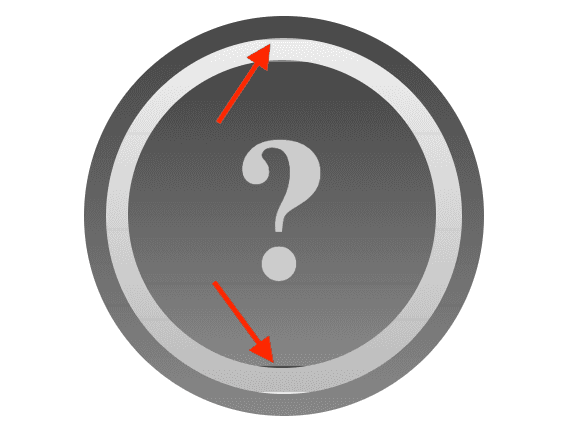
October 12, 2020Jackson Gabbard posted this brainteaser and I decided to take a crack at it!
The rules!
- One <a> tag.
- No JavaScript.
- No images.
- No SVGs.
- No box shadow!
The start!
<a class="magic" href="#"></a>The goal!
10 minutes later…
Okay, this is harder than I thought it would be.
30 minutes…
I ran into some trouble with a clipped top and bottom on the inner circles.

I fixed this with a background-origin that expands the bounds of the background gradients:
background-origin: border-box;40 minutes…
I'm so close! But the question mark is vibrating during the transition…
Maybe I just need the right font?
I took a dive into this great writeup on CSS fonts and line heights. That got me thinking that my text vibration problem might be due to the font's content-area vs. line-height. Maybe this will all work better if I use the same font as Jackson? I might as well try to make an exact replica anyway.
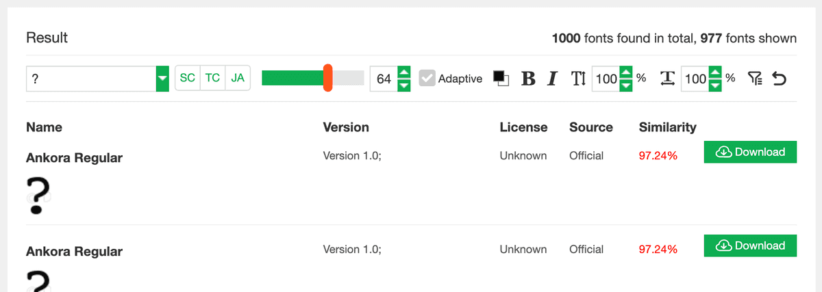
After trying a bunch of things, I ended up using a screenshot of his question mark and likefont to find Ankora.

A couple hours later…
I fixed the text vibration! by switching to firefox.
The last stretch…
After fixing the vibration, the text is now shifting slightly down during the transition… and I noticed that the border animation is staggered instead of happening all at once.
I fixed both of these problems by changing:
transition: all 0.25s;to:
transition-duration: 0.25s;
transition-property: font-size, line-height;
I only need to transition the font-size and line-height to keep the question mark the same size on hover.
These will scale down in size to counter the increase from the parent element.
The other changes to the :after element on hover should be immediate.
My solution!
With code!
<a class="magic" href="#"></a>

<style>
@font-face {
  font-family: Ankora;
  src: url(ANKOR___.ttf);
}
:root {
  --scaling: 1.075;
  --transition: 0.25s;
  --width: 200px;
  --border-width: 11px;
  --hover-border-width: 1px;
  --in-width: calc(var(--width) - var(--border-width) * 2 - var(--hover-border-width) * 2);
  --in-in-width: calc(var(--in-width) - var(--border-width) * 2 - var(--hover-border-width) * 2);
  --font-factor: calc(var(--width) / 2);
  --green: Lime;
}
.magic {
  backface-visibility: hidden;
  background: linear-gradient(0deg, #888 0%, #444 100%);
  border-radius: 50%;
  display: block;
  font-family: Ankora;
  height: var(--width);
  position: relative;
  text-decoration: none;
  transition: transform var(--transition);
  width: var(--width);
}
.magic:hover {
  transform: scale(var(--scaling));
  transform-origin: center;
}
.magic:before {
  backface-visibility: hidden;
  background: linear-gradient(0deg, #bbb 0%, #eee 100%);
  background-origin: border-box;
  border: var(--hover-border-width) solid transparent;
  border-radius: 50%;
  content: "";
  display: inline-block;
  height: var(--in-width);
  left: var(--border-width);
  position: absolute;
  top: var(--border-width);
  width: var(--in-width);
}
.magic:hover:before {
  border: var(--hover-border-width) solid var(--green);
}
.magic:after {
  backface-visibility: hidden;
  background: linear-gradient(0deg, #888 0%, #444 100%);
  background-origin: border-box;
  border-radius: 50%;
  color: #ccc;
  content: "?";
  font-size: var(--font-factor);
  height: var(--in-in-width);
  left: var(--border-width);
  line-height: calc(1.1 * var(--in-in-width));
  margin: calc(var(--border-width) + var(--hover-border-width) * 2);
  position: absolute;
  text-align: center;
  top: var(--border-width);
  transition-duration: var(--transition);
  transition-property: font-size, line-height;
  width: var(--in-in-width);
}
.magic:hover:after {
  border: var(--hover-border-width) solid var(--green);
  color: var(--green);
  font-size: calc(var(--font-factor) / var(--scaling));
  line-height: calc(1.1 * var(--in-in-width) - var(--hover-border-width));
  margin: calc(var(--border-width) + var(--hover-border-width));
}
</style>